(Introduction)
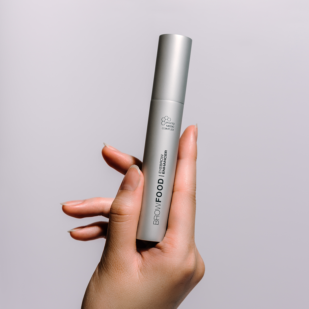
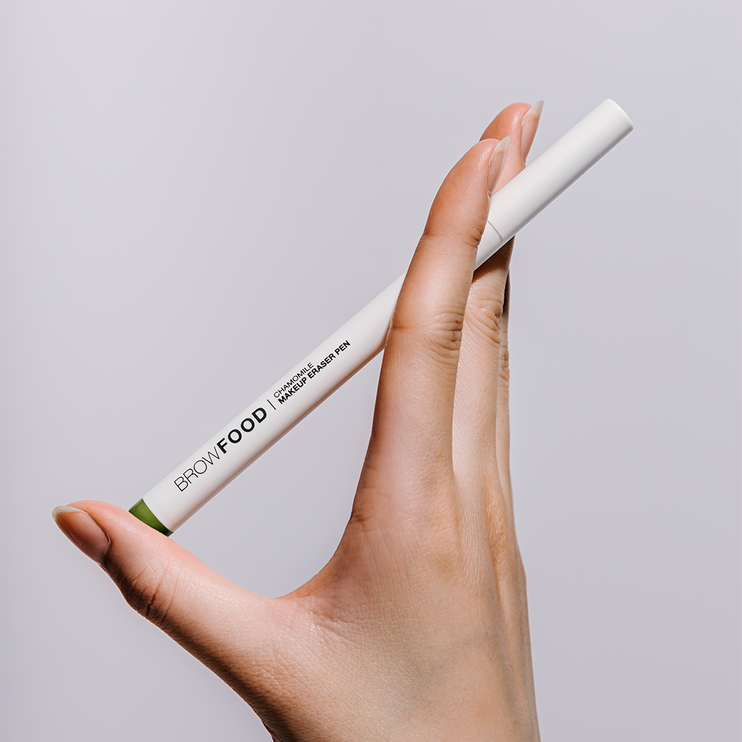
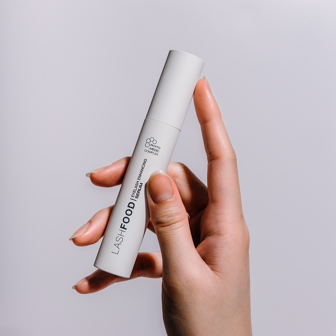
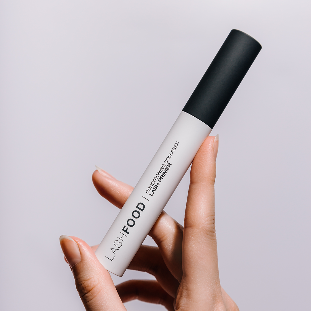
Art Direction, photography, and graphic design for lashfood, a brand carried by sephora born out of the philosophy that clean ingredients can also have effective results.
(Project type)
Art Direction, Graphic Design, Photography + Retouching
(Credits)
Lashfood
(Challenge)
Lashfood is a company that Sephora carries - it was born out of the philosophy that clean ingredients can also have effective results.
(Ingredients Campaign)
We began transitioning Lashfood’s feed into a more luxe, slightly darker feed to coincide with the holiday feels.
education strategy - Lashfood needed to reiterate why our ingredients are included and what ingredients set us apart from our competitors as we were finding from Sephora that site visitors and new customers were having trouble with brand awareness.
set expectations - When compared to our competitors, Lashfood’s products tend to take a “slower” approach - acting more like vitamins that help enhance lashes instead of (for example) GrandeLashes’ “get results in 4 weeks!”.
We focused more on macro shots, ingredient textures, more education focused (why we included it, what does it do).
(Holiday Campaign)
“Give the gift of sustainability” - Treat yourself, treat your mom, treat your sister, treat your community.
4-6 weeks before NY “start your regimen now, get your lashes by New Years!” - kit push /last minute gifting
Visuals will push “holiday” narrative without feeling too holiday - come up with ideas for holiday themed treats that can go into the bag. “Treat yourself” with this bag - Fill this bag with treats!


