Design Failures - my first blog post.
Wow. First time blogging. First time putting my words into the void.
I decided my first post would be simply me dumping my class projects into the void. These aren’t necessarily my proudest designs or my proudest moments, but why the hell not?
Enjoy!
xo,
J
Rebranding project

original

rebrand

Going for some “I’m usually a yoga mom who drinks frosé, but it’s nighttime and I’m trying to be classy” + “basic bitch” vibes. How’d I do?
Ahh.. the quintessential rebranding project that almost all design majors have to do. When I did this project, I had either just turned 21, or haven’t graduated college yet. My inner basic bitch could only stand to drink what can only constitute “adult koolaid” - and boy, did I gladly drink that koolaid. You think this “redesign” was bad? You should have seen me 3 bottles of Stella Rosa in!
Baseball card

OK THIS ONE - I’m actually quite proud of myself for this one for multiple reasons. I basically produced this from beginning to end. AND I got this done quickly and efficiently after procrastinating for way too long. #AmIDoingCollegeRight?
The brief for this one was to design and create a baseball card based on one of the staff (not sure if the choices were limited to professors within my department or to university staff in general - it’s been too long for me to remember and tbh, there weren’t a lot of people in my department anyways). We were to interview them, find out trivial details that only potential stalkers would be interested in, and then create a card based off their facts and personality.
Eric was gracious enough to not only just give me his information, but also entertain me with a mini-photoshoot that took all of 15 minutes. I shot him in various stages of celebration and shits+giggles (wearing his fav jerseys ofc) with a Canon 5DMK2 using a 50mm f/1.4 (wide open like the freakin’ n00b that I was). Processed the RAWs in Adobe Lightroom (presets are fun…), and then exported them all as JPGs into Illustrator so I could vector mask them out on top of his beloved Portland International Airport carpet background (dude’s from Oregon).
NGL, I was pretty proud of myself. It was even nicer when I had the card physically in my hand in decent cardstock - peep that wannabe holographic “ERIC RENN” using a blending mode on the right.
Low-Poly


Sigh* This was such a trend back in 2016/2017. Geometric low-poly art done well is such a vibe (and I really tried). The Gary Clark Jr. portrait was for fun and giggles (when I had time for fun and giggles in college). If you’ve never seen Vagina Monologues, it’s an episodic play written by Eve Ensler (first performance was back in 1996, to give you a timeframe). Ever since, it’s been noted to be ahead of its time, but very problematic in today’s day and age (preying on unknowing minors and its lack of inclusion for transwomen).
But it was still a pretty dope play to be a part of! #MyVaginaIsAngry
In terms of design, I really wanted to jump on this trend (idk why, but I didn’t see other people around campus displaying this kind of design) and pair it with a type study. I wasn’t very good at matching + pairing fonts together (I now know WAY better), so this was good practice for me as well.
Poster Design
1

2

3
4

5
I just want to fucking cringe whenever I see these posters. ESPECIALLY #5 - I thought I was being super edgy with the illustration when really, someone should have slapped me for shitty kerning.
In order:
ERRORS UPON ERRORS. Definitely didn’t know what the fuck I was doing. Had an interesting idea, but terrible execution.
I wanted the spoopy Halloween vibe, but it just looked too mismatched with the decorative font and waaaay too simple (traced over real images) vectors. I definitely didn’t pay attention to kerning on this one EITHER. SMH. I remember when I was working on this one, I had JUST started on Illustrator and got really confused about where my points were and how they interacted with each other. TO THOSE OUT THERE WANTING TO LEARN ILLUSTRATOR - there’s a huge learning curve, but totally worth it!
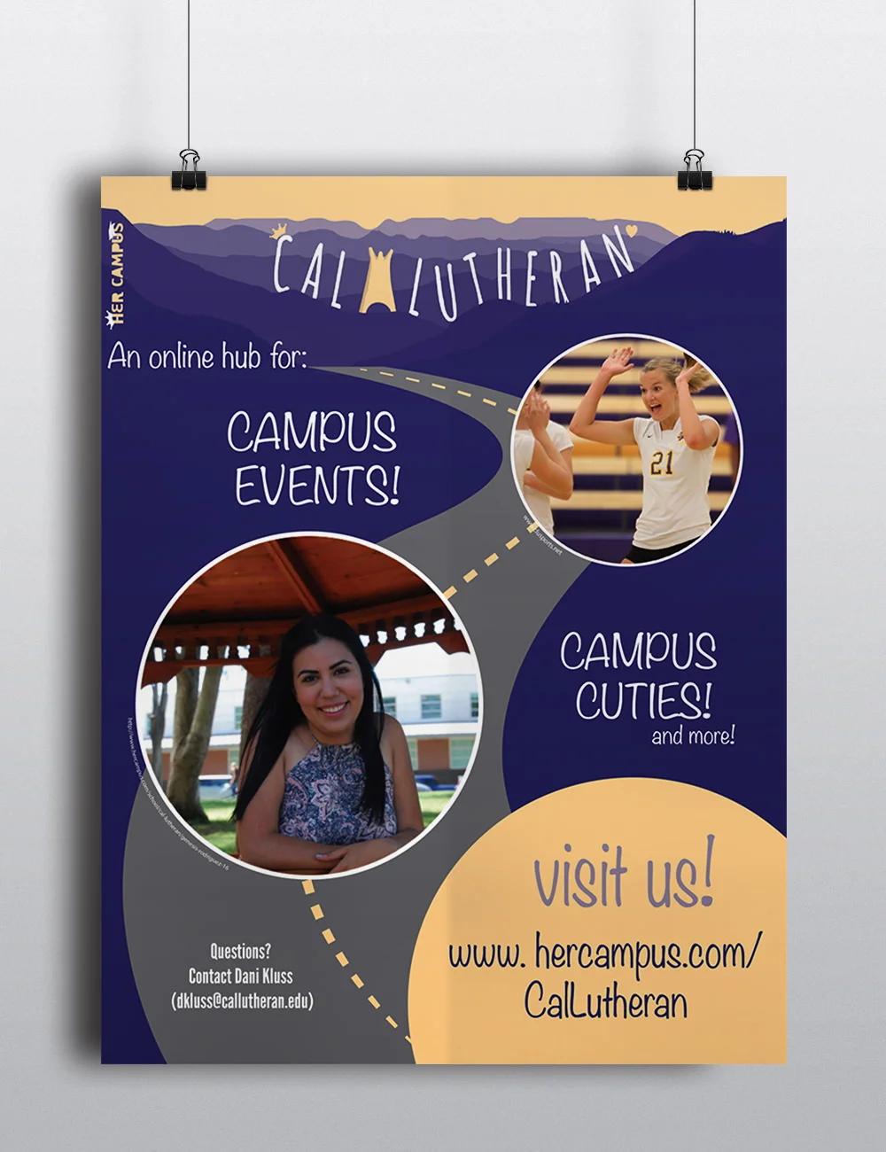
HA. Oh man. The memories this one brings. I was “Head of Visual Post Processing” for Humans of Cal Lutheran - a campus spin-off of Humans of New York that a classmate of mine started up. Me being the control freak I was, edited almost all the pics that came through my way. Man oh man did that fuck me up. Definitely forced me to speed up my work flow and make it more efficient, but damn. My friend, Ricky, took the picture of the Peterson Library, and I imaged traced a silhouette of a pointing girl (literally just google “silhouette pointing girl” and you’ll probably find the same shadow). I think I could have done better by making the fonts a little more consistent in terms of sizing and hierarchy. Those bars fucking irritate me now. Can we burn JPGs? Is that a thing?
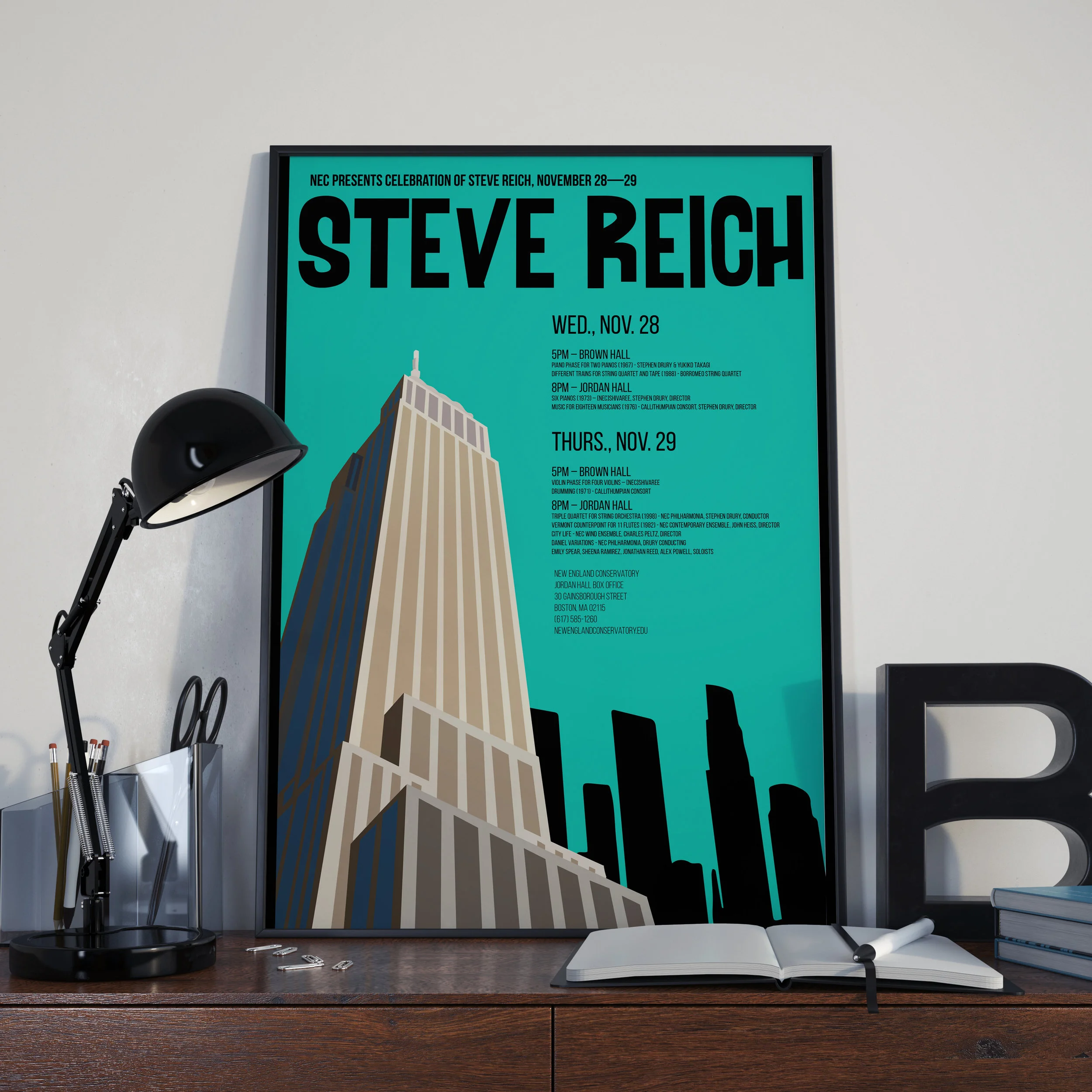
Actually not bad - but I put this up to show you how inconsistent my fonts were. I really stuck to the “2 or 3 fonts max!” rule but used different weights and sizes. My dumb ass still didn’t know that I could adjust kerning so this font just looks all squished. Hierarchy wasn’t bad. I remember getting a picture of the Empire State Building, skewing it in Photoshop for perspective, then using the Adobe Creative Cloud library to move it over to Illustrator to trace over (BY MACBOOK 2012 TOUCHPAD INSTEAD OF A TABLET LIKE I WOULD HAVE IF I WERE SMART), and then creating the entire illustration 30 minutes before class, then skateboarded straight there from my dorm. College Joyee wasn’t a very smart cookie. She was an oatmeal raisin cookie.
UGH. Oh God. The kerning. My eyes. They fucking burn!!!! (also, don’t try to be edgy, kids. It ‘s a horrible look and gahtdamn it just makes me cringe so hard looking at it.) LEARN FROM MY MISTAKES.
Logos


HAHAHA. These logos are all disasters. Lawd, have mercy on me.